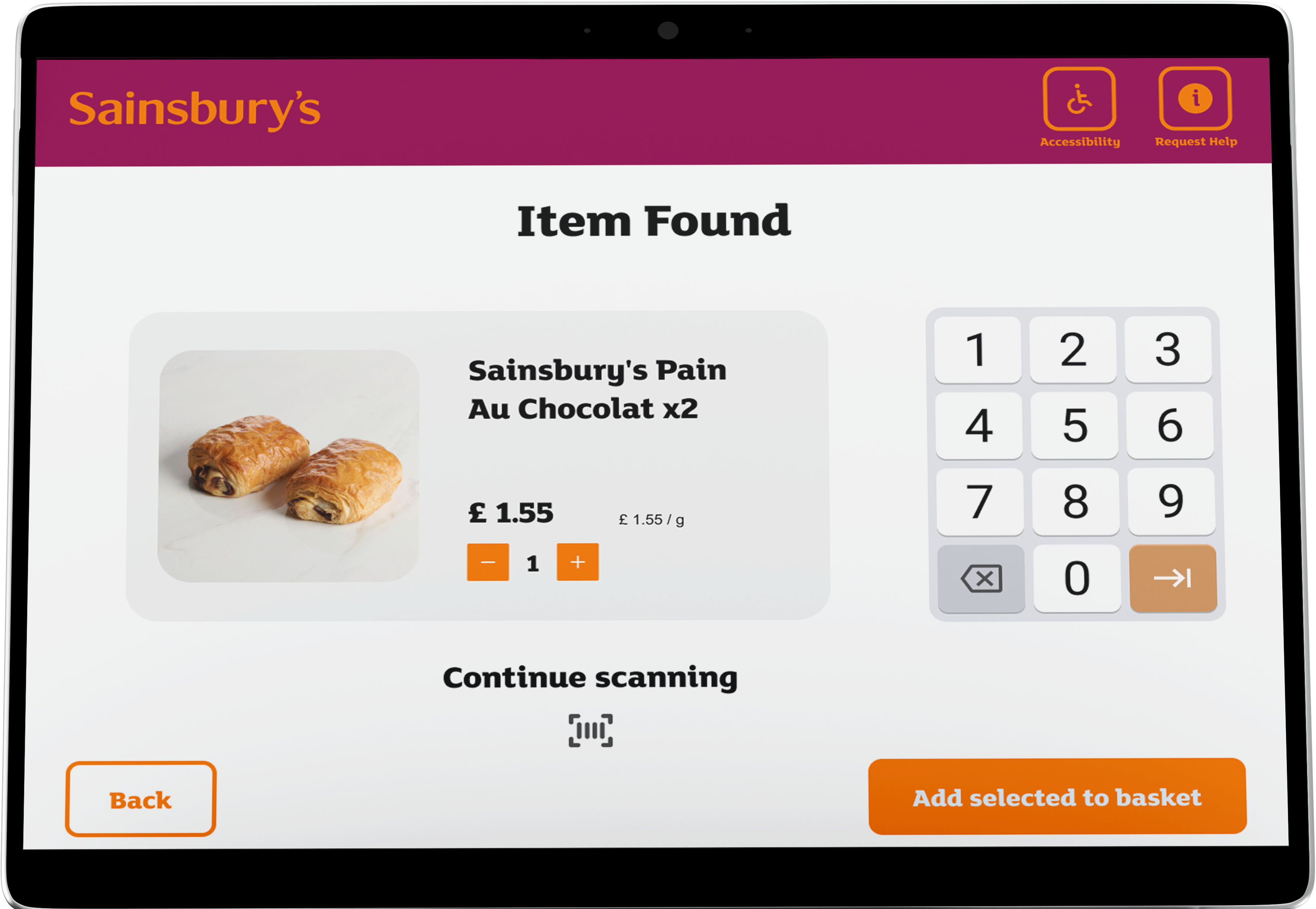
Problem Statement
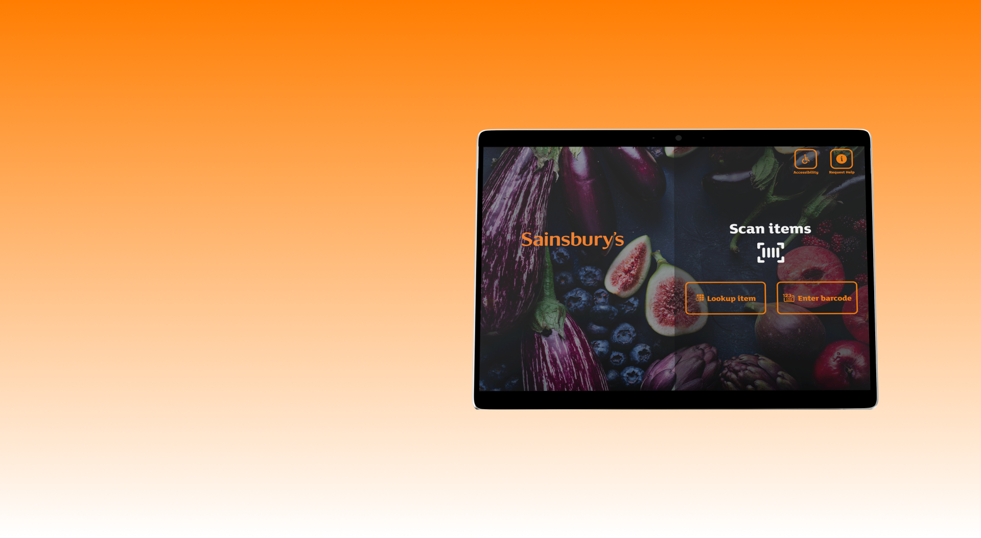
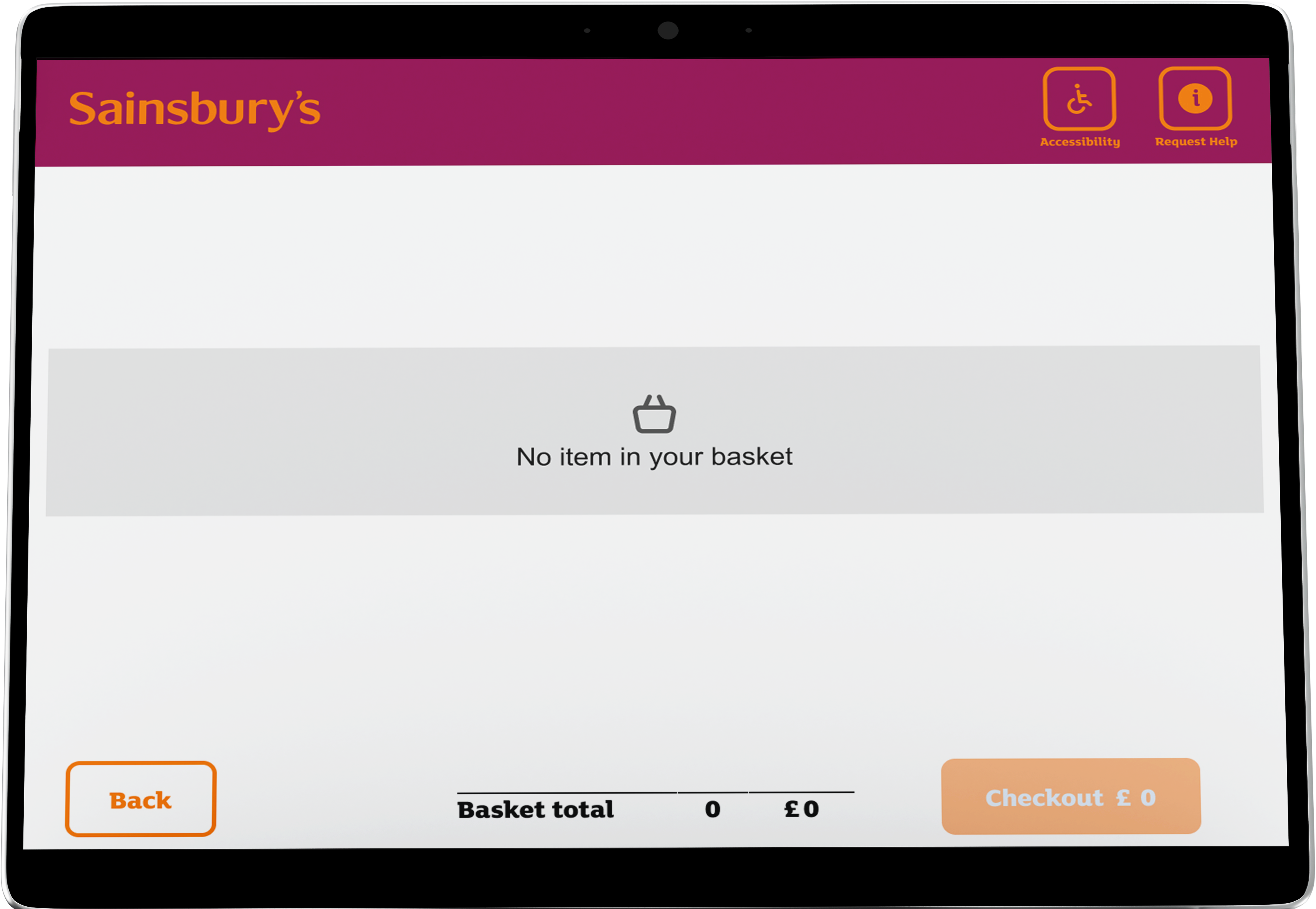
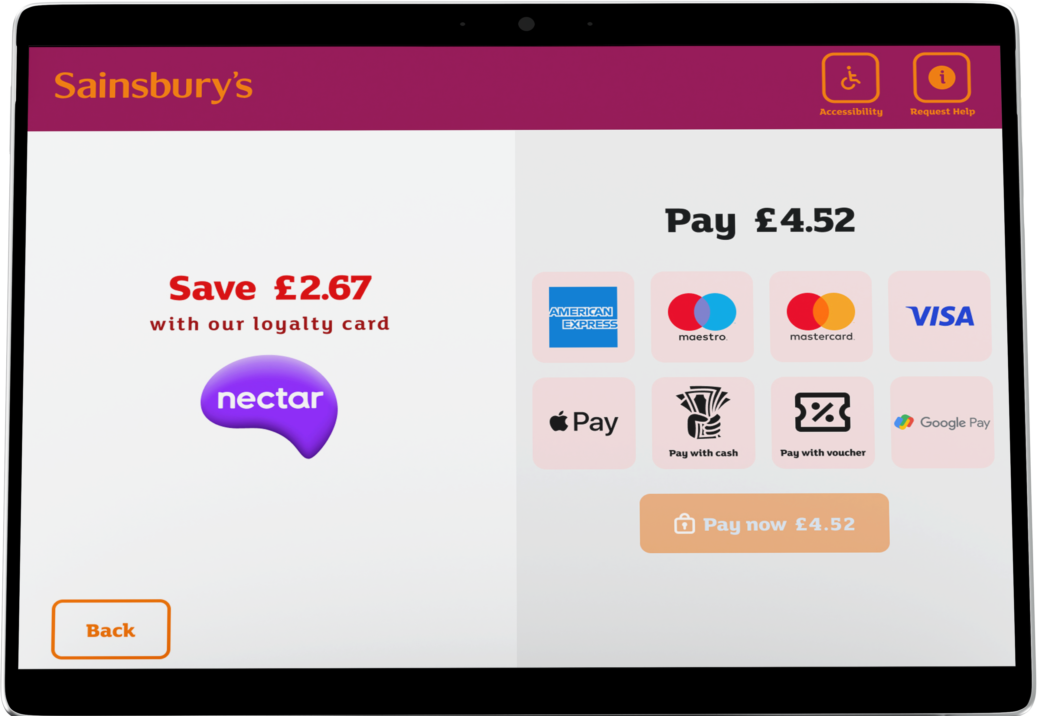
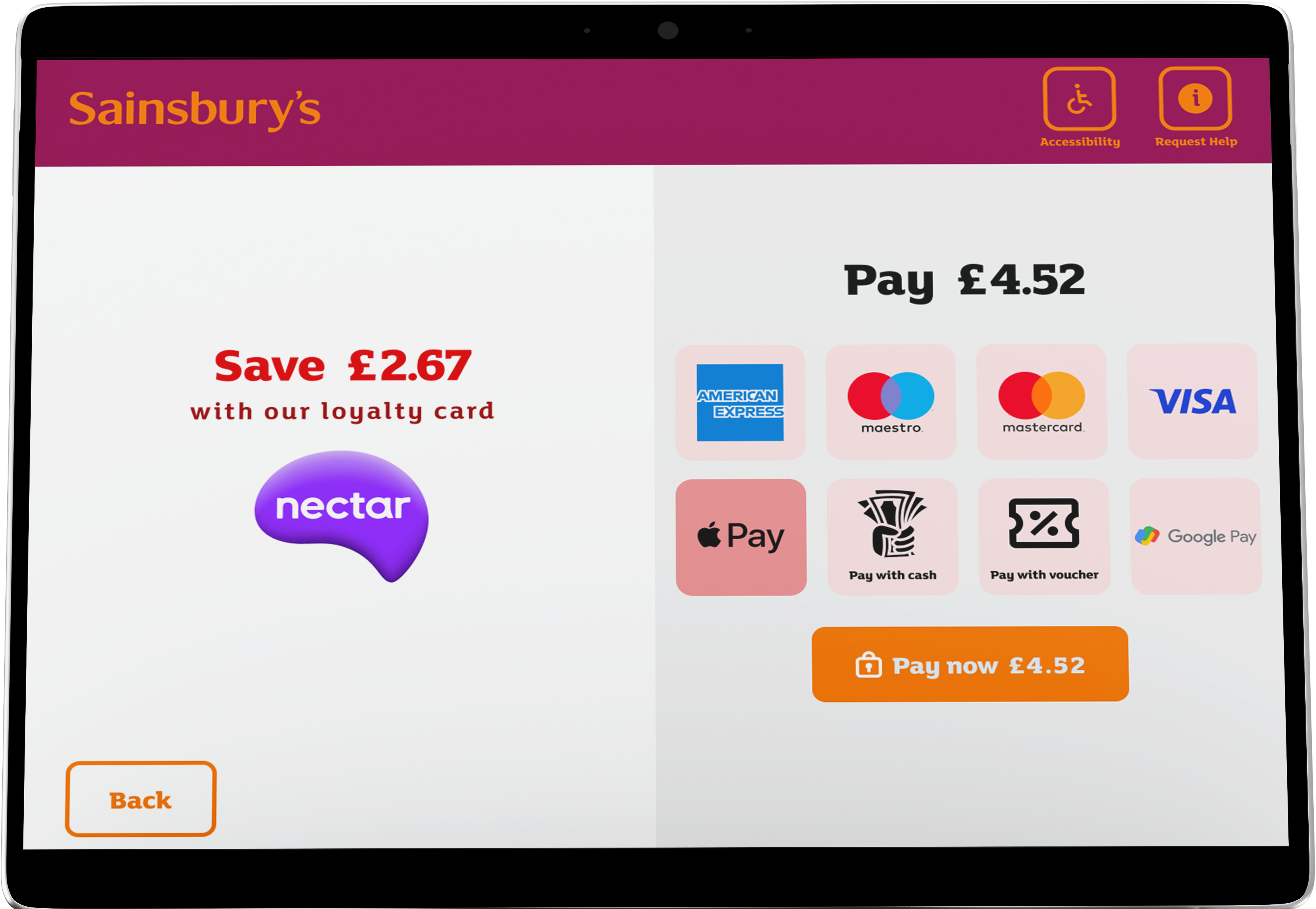
The current self-checkout kiosk design (as of 2023) may not fully align with evolving user preferences, leading to occasional usability issues, user frustration, and potential loss of business. I aimed to address these concerns by proposing a new design.
How Might We?
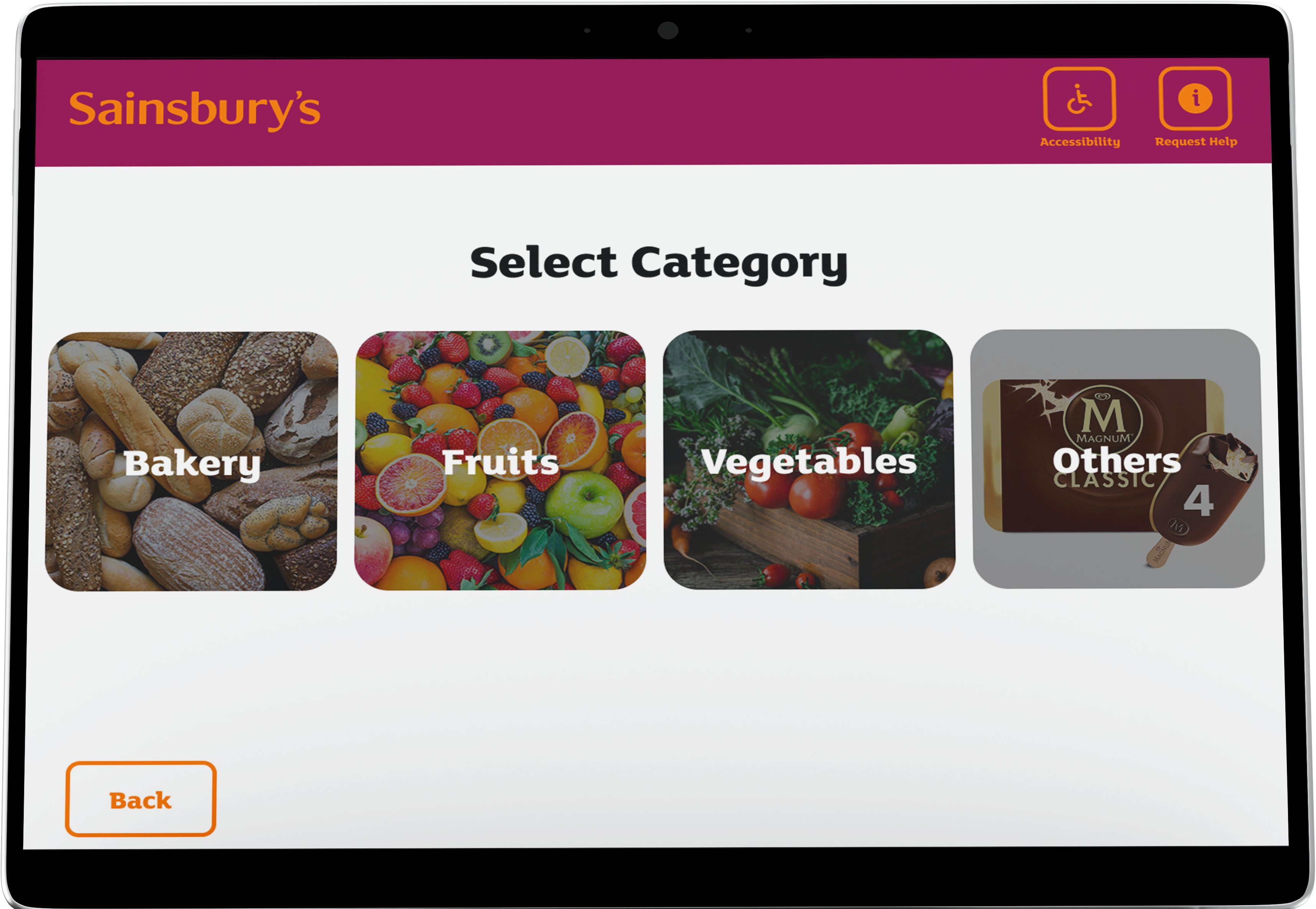
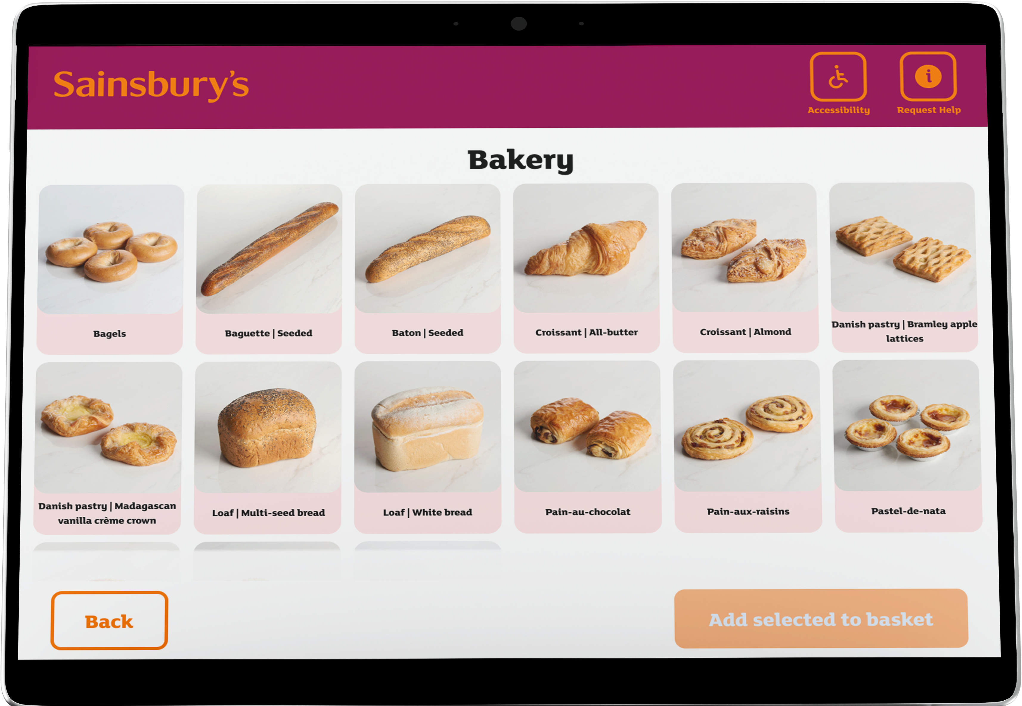
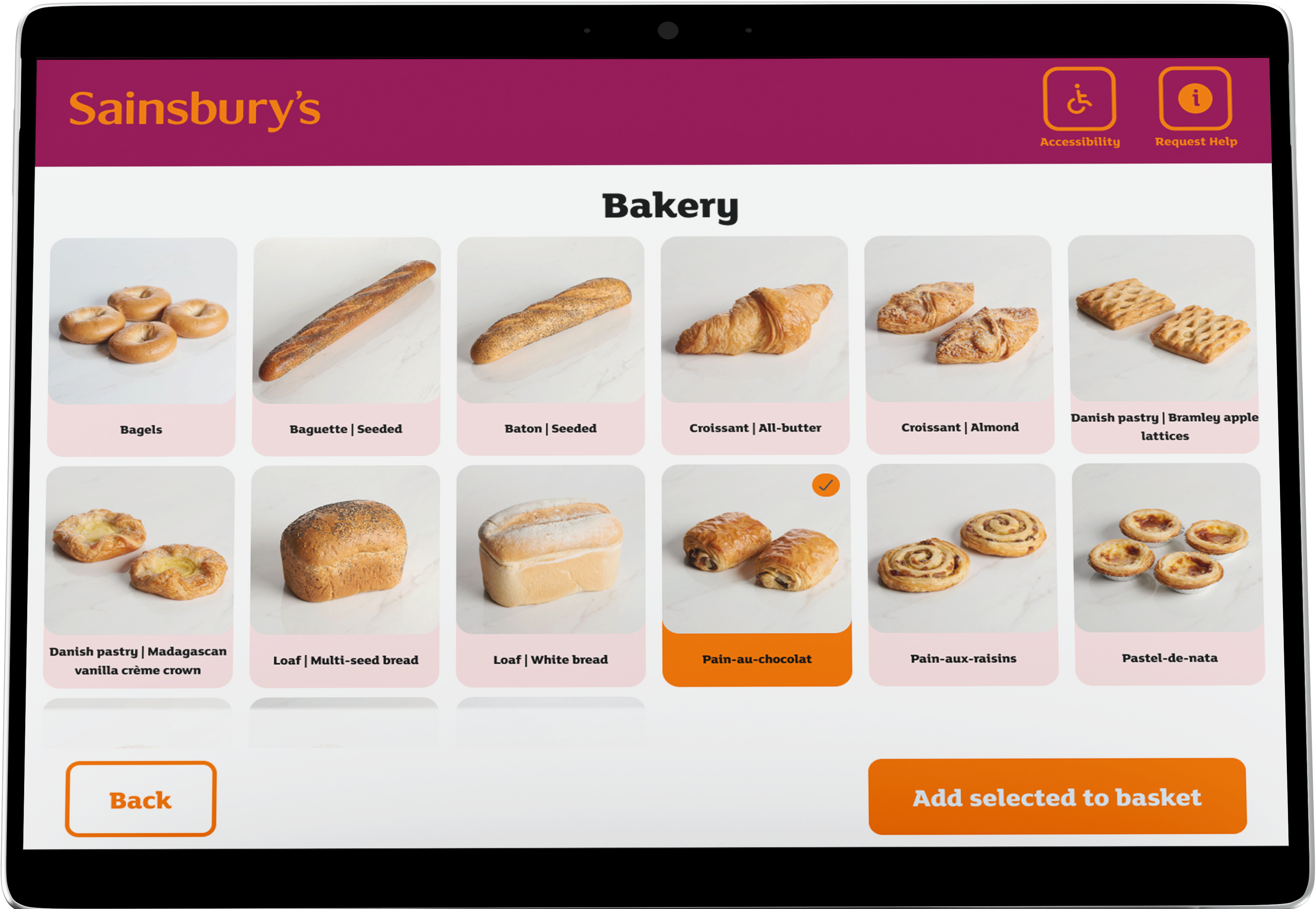
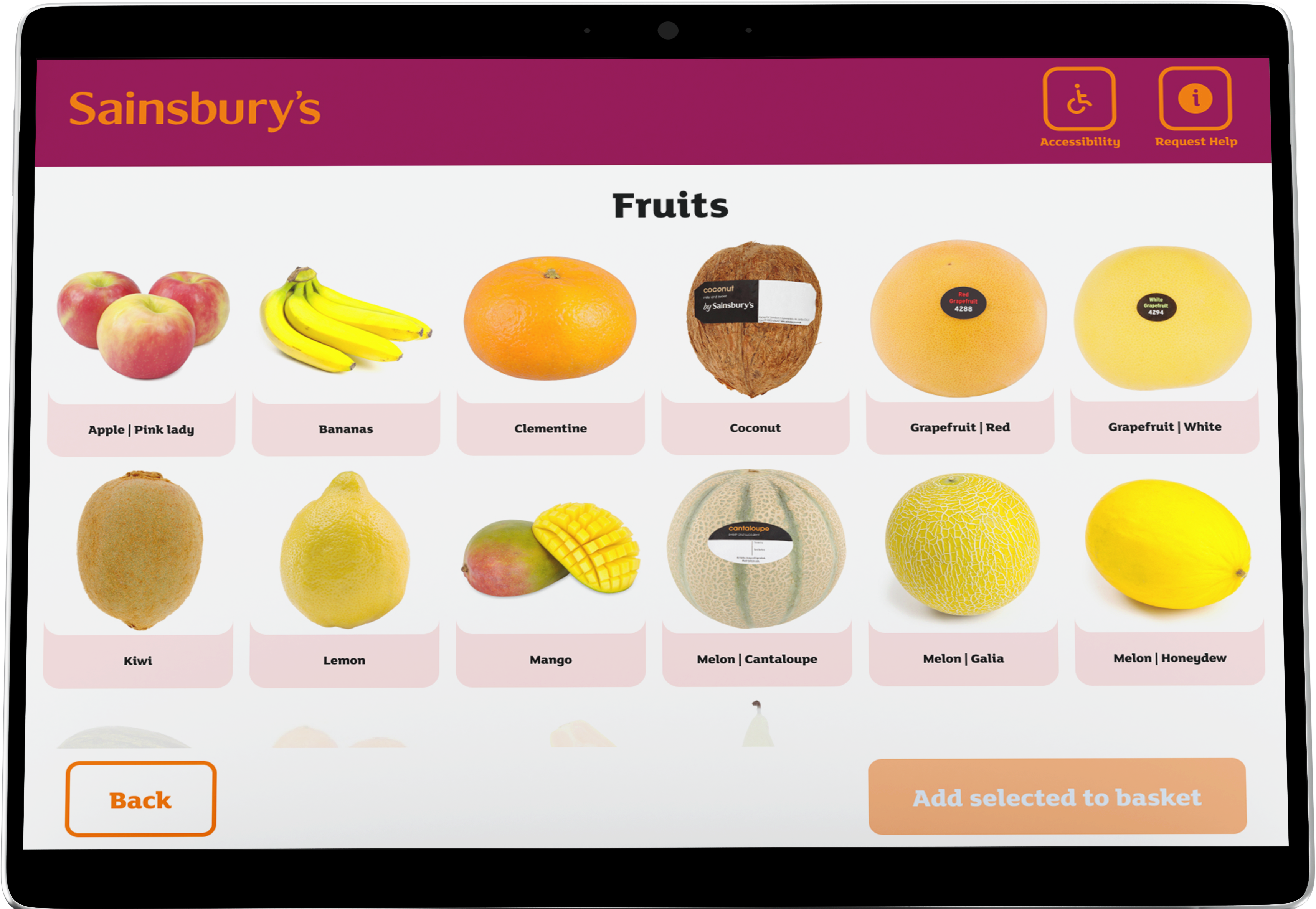
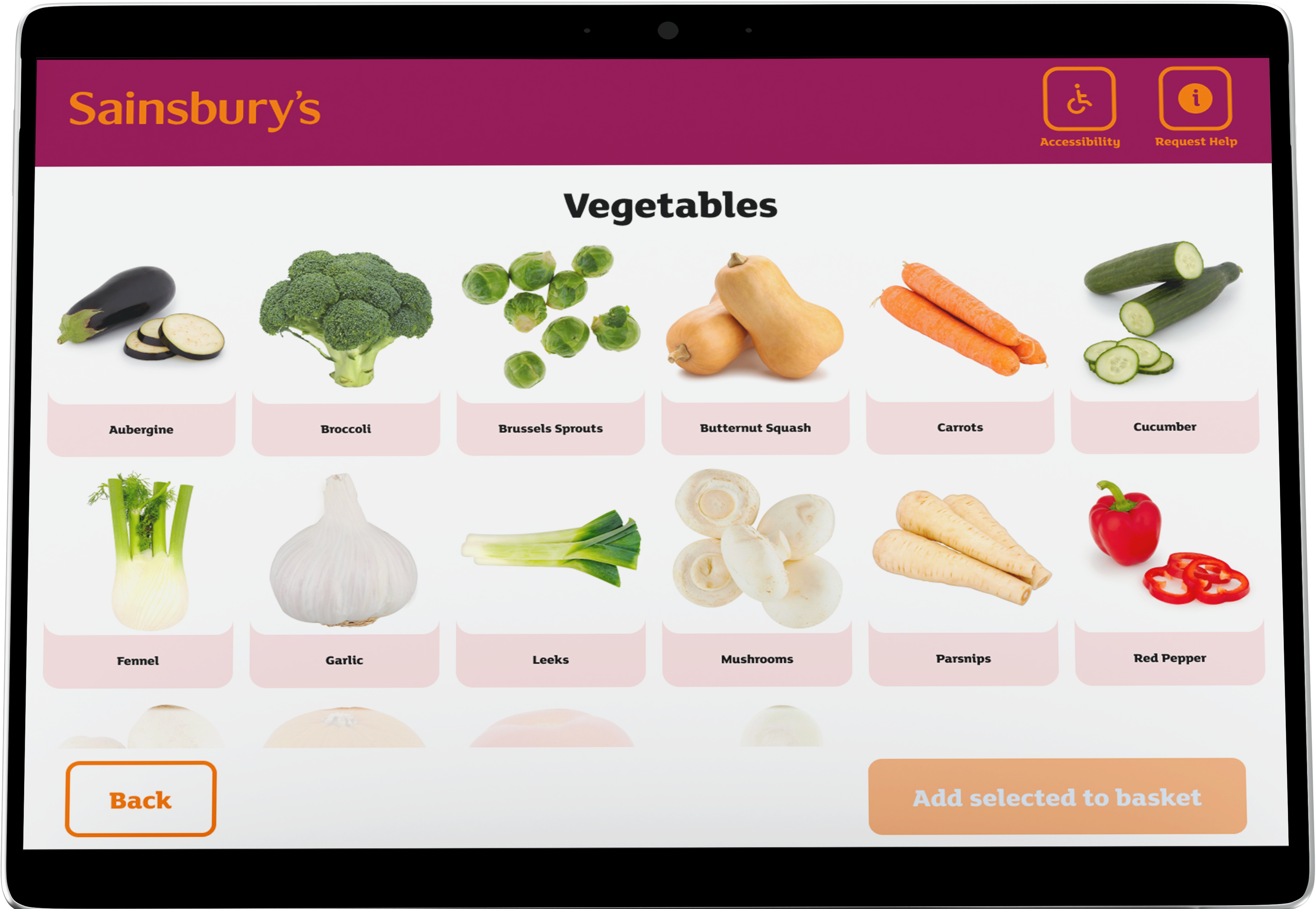
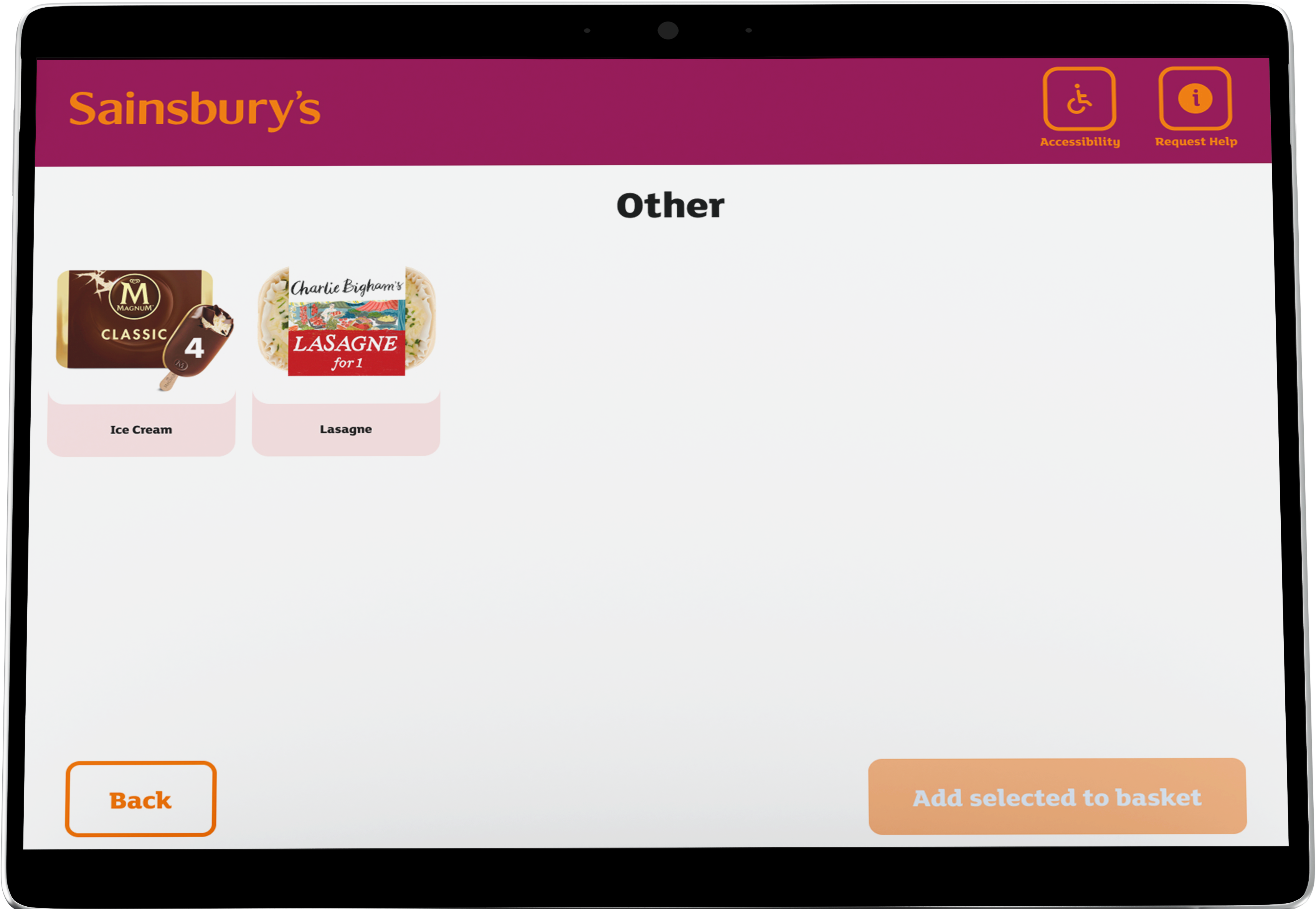
How might we redesign the self-checkout kiosk experience to make weighing loose items easier and improve UI responsiveness, ensuring a smoother checkout that retains customers?
User Journey
Using FigJam, I highlighted the pivotal steps in the user journey when engaging with a self-checkout system.

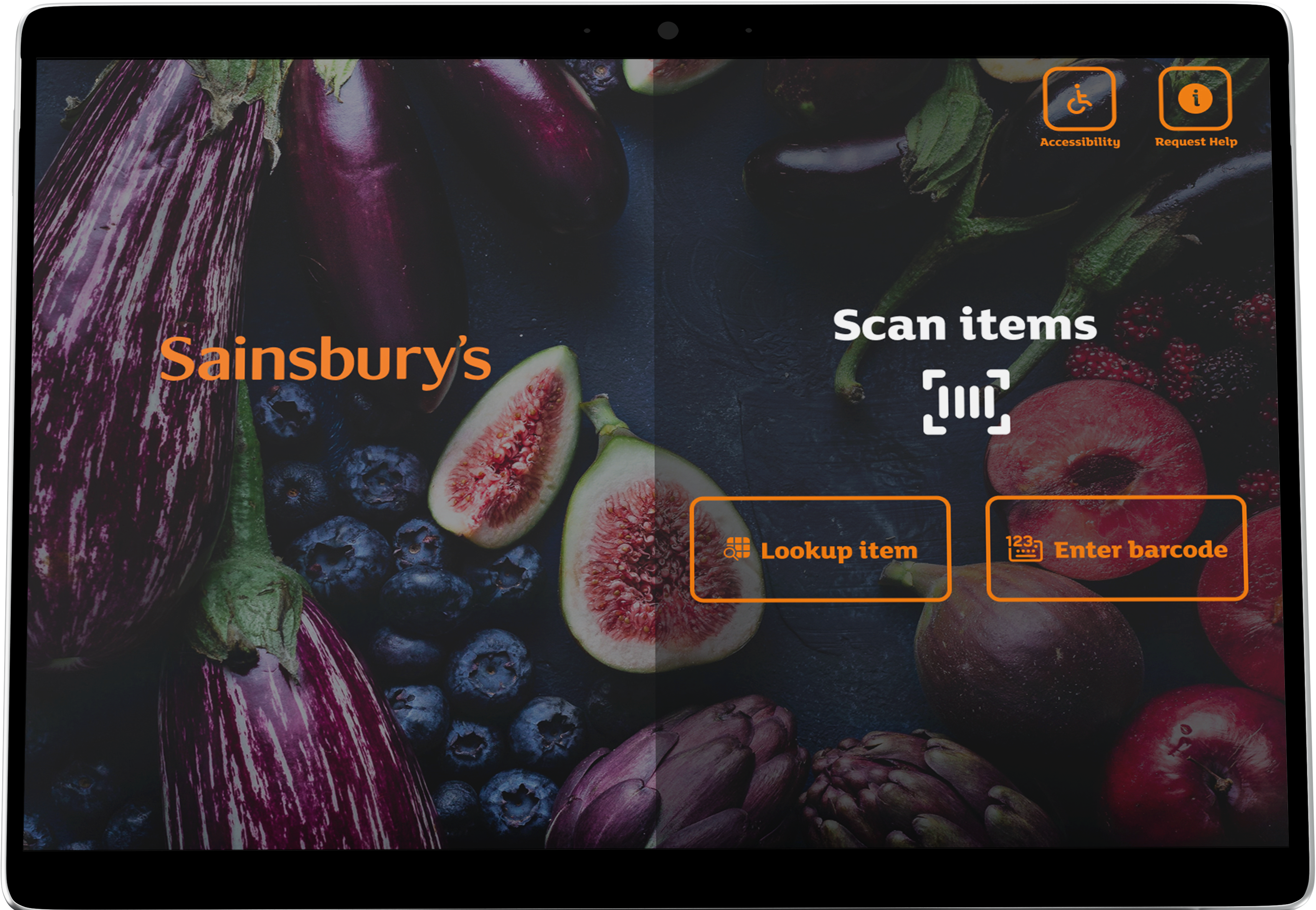
I designed this flowchart to illustrate the initial user interface, offering three interaction pathways:
- Scan item's barcode
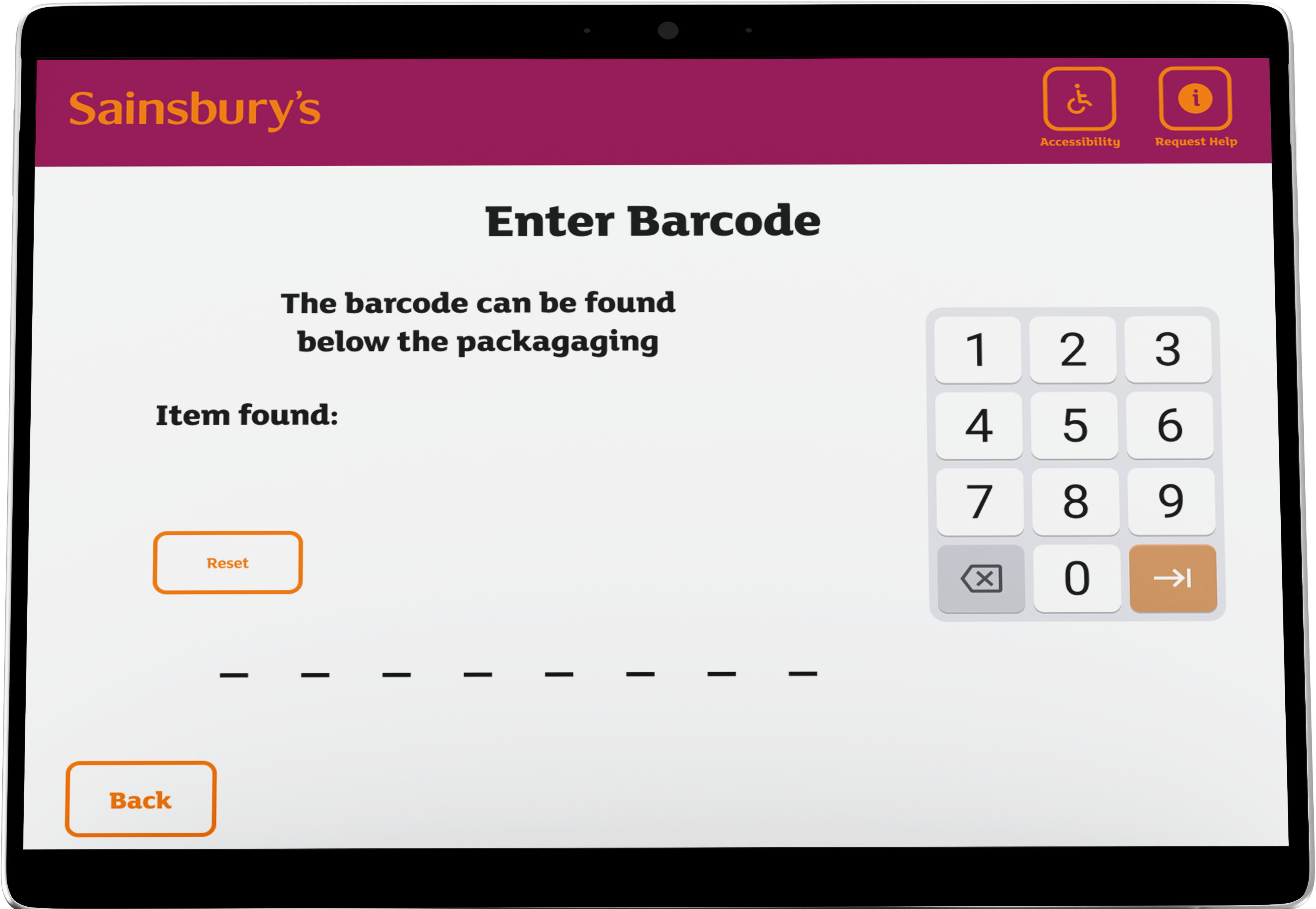
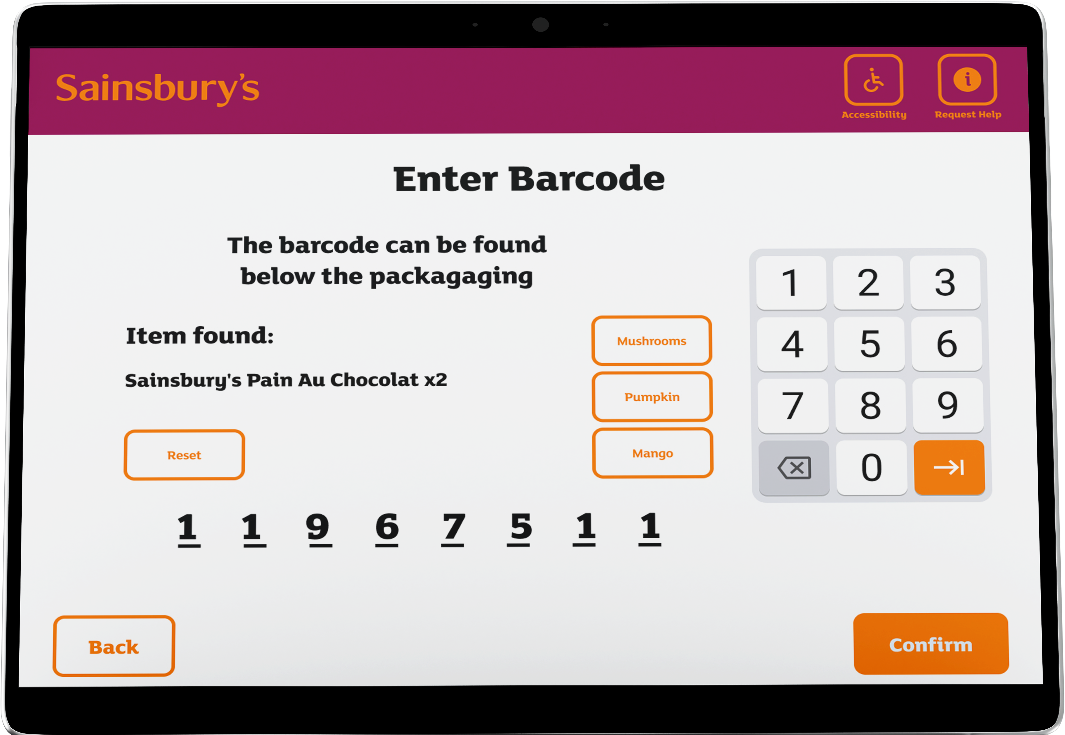
- Manually enter barcode
- Ask for assistance
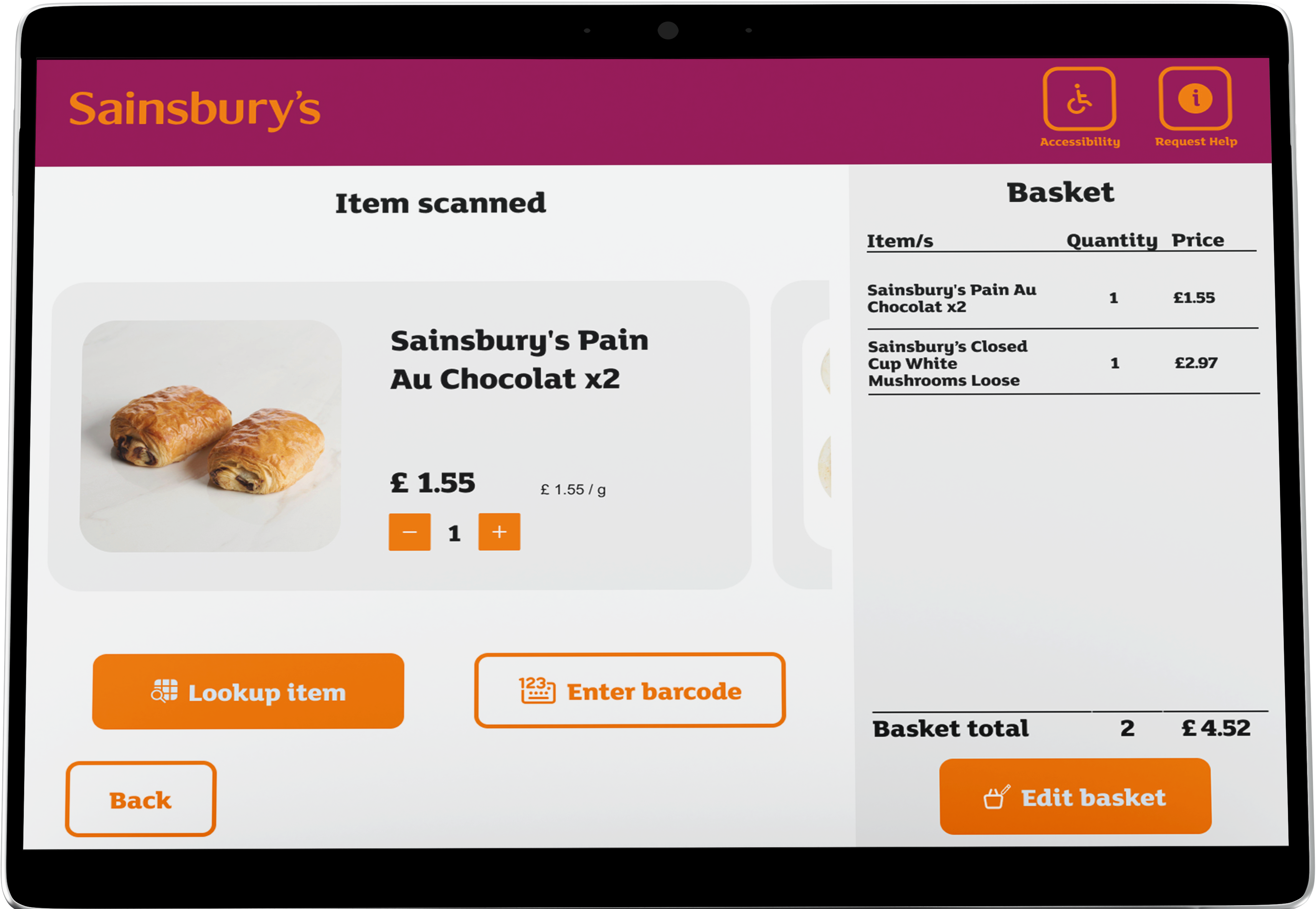
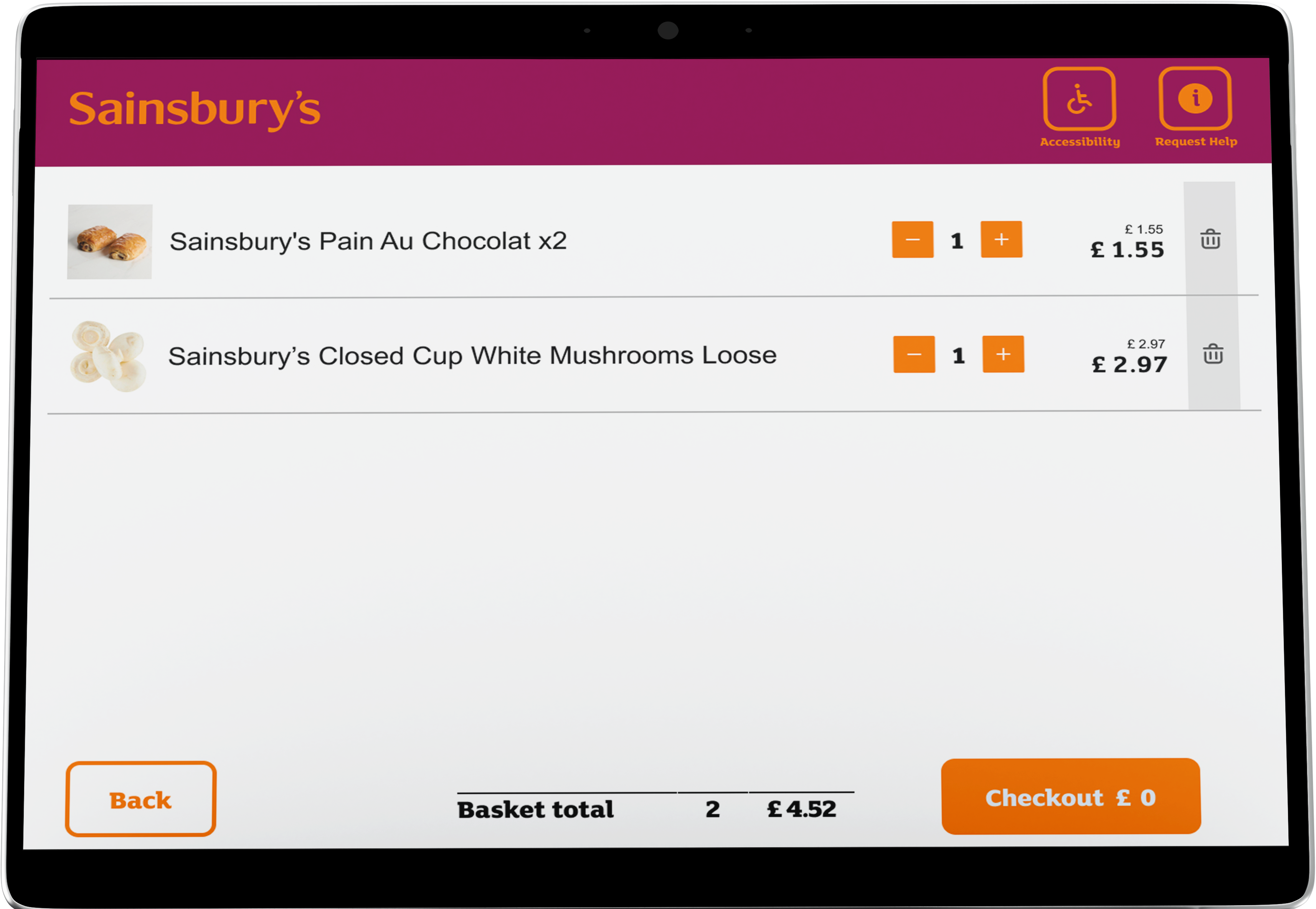
These choices initiate a series of user interactions aimed at barcode verification and product validation. The system subsequently assesses whether the item has been successfully placed in the bagging area before incorporating it into the user's basket and recalculating the total basket value.
Unhappy Paths and Error States
It's important not to neglect those scenarios when things go wrong - that's when users get frustrated most and will most likely end their journey. I've mapped those unhappy scenarios such as when an item is not recognised in the bagging area or if a payment gets declined.
